DeepL - Brand & Marketing Asset System
DeepL's Creative Studio designs across product, marketing, events, and internal comms, for EU, US, and APAC markets. The brand foundations existed. The assets built on top of them did not live anywhere shared.
My role
Brand system designer, owner of DeepL's Creative Studio asset library.
Team
DeepL brand design: Pentagram and Ana Rodrigues
The project
Turn a scattered set of files into a single managed library covering the styleguide, illustrations, icons, key visuals, and product UIs: everything the in-house design team needs to create efficiently. Pentagram had supplied the brand and the guidelines. The gap was everything downstream, the assets the team used every day, spread across individual files with no shared source.

The solution
Curated, not mirrored
DeepL has several products: Translator, Voice, document translation, and others. Each is owned by a different team. They share a product design system at the atom and organism level, but the final app views and UX flows are handled separately by each team.
I built a UI library holding those final interfaces, collecting only the screens actually used to promote a product or feature. The Translator main screen earns its place. Settings, login, and error screens do not.
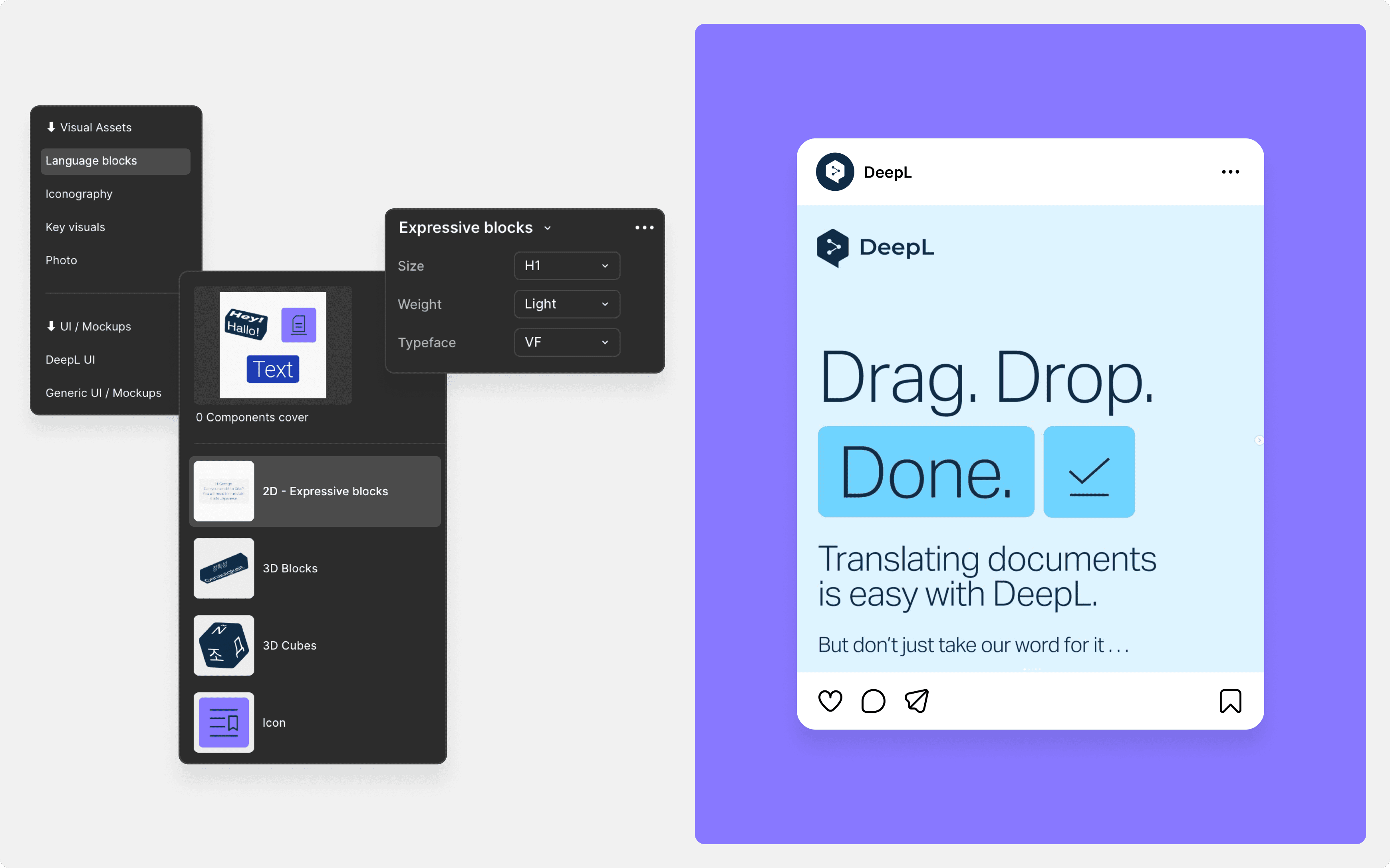
Marketing work also constantly reuses pieces of the UI, a button or a dropdown blown up to emphasise an option. I added those as standalone elements with a heavily simplified variants panel, in some cases rebuilding the component down to the marketing essentials, so the whole team reaches for the same element instead of rebuilding their own.
Organised by feature, not by component
Most libraries file components by type: all buttons here, all modals there. Inside the UI page I did the opposite, with sections named after DeepL features. Base components, Translator, document translation, voice translation, and so on. Every button, dropdown, and modal belonging to a part of the product sits together, named after that feature, because that is how the team thinks when they open the file.


The solution
Illustrations built to assemble
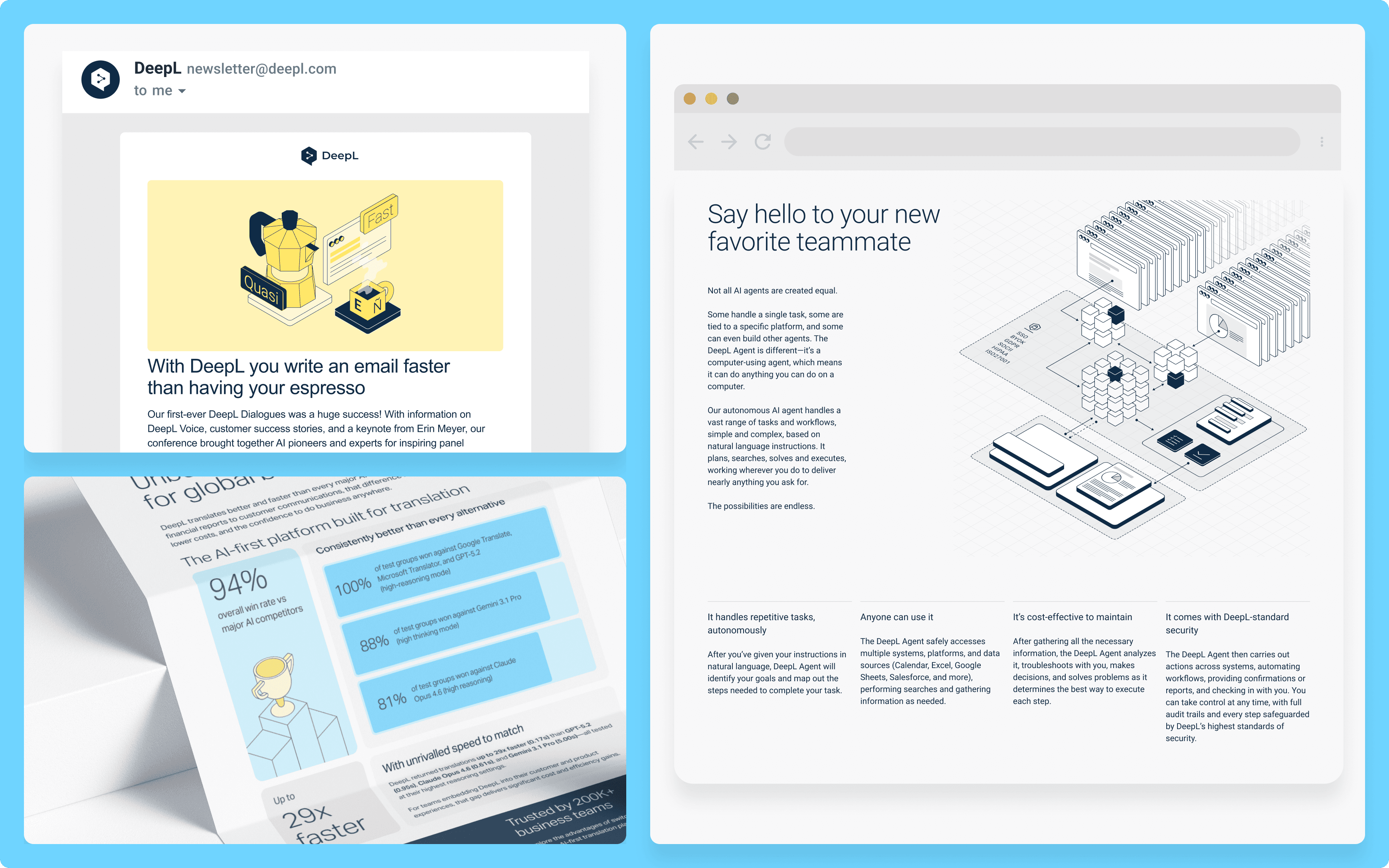
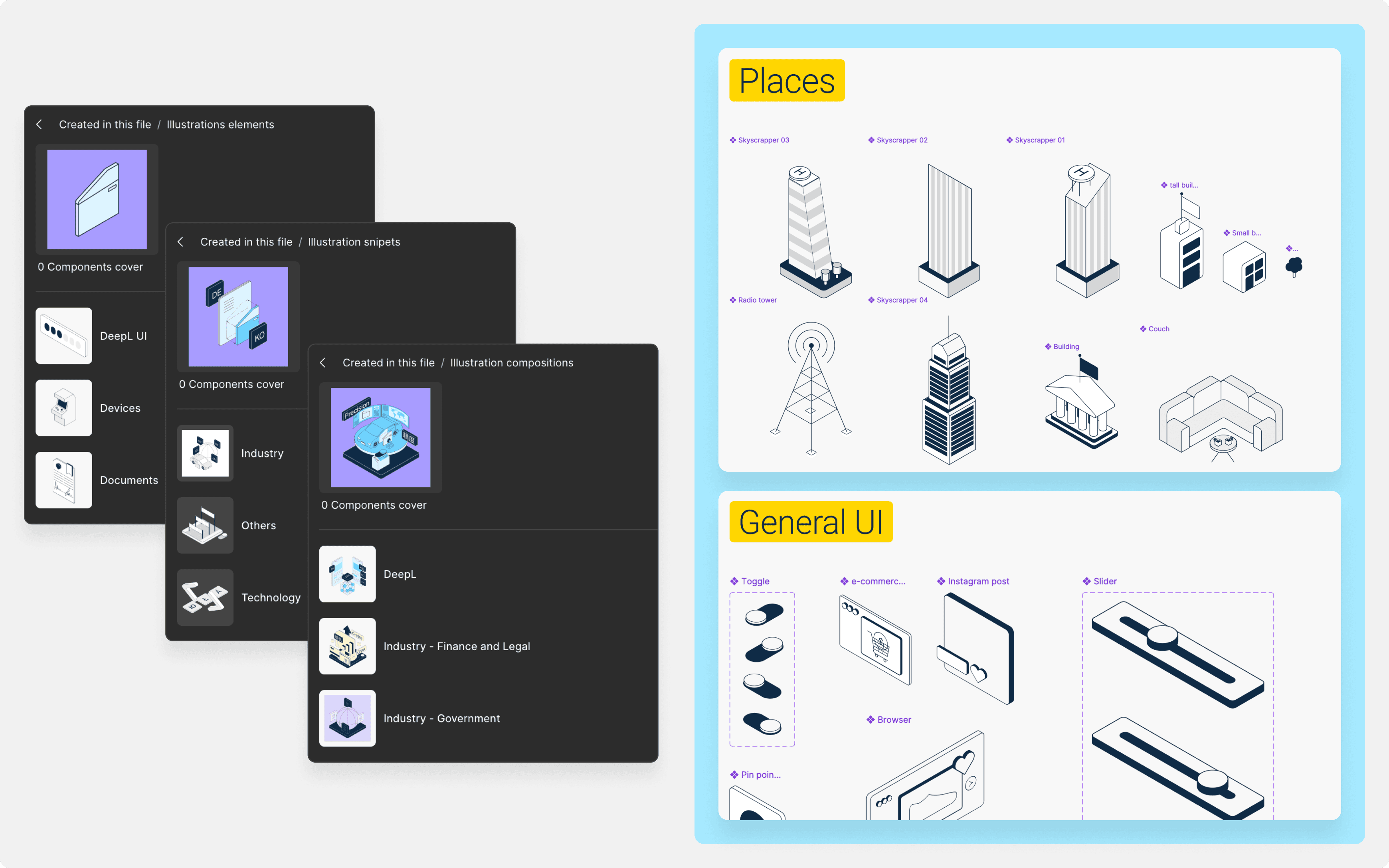
The isometric illustrations are structured in three tiers. Heroes carry a complex idea and are used on landing pages, the website, and emails. Snippets work like heroes but are simpler, with fewer elements, so they fit smaller designs. Diagrams are informative illustrations that clarify a process. Alongside the tiers, the library holds isolated illustrative elements: cubes, toggles, mugs, arcades. Together, the tiers and the illustration components let someone who is not an illustrator assemble something on-brand from parts, rather than commissioning a new drawing.
Non-adoption is a design problem, not a compliance problem
The whole team could propose additions. I decided what to implement, how, and when to publish. In practice a designer would tag me on a UI they had adapted from product into marketing language. If it already existed in the system, I would find out why they had not used it, because that almost always meant something was unclear or hard to find. If it did not exist, I would build it, connect it to the styleguide, and publish the update to our channels.
Results
70% increase in production efficiency across EU, US, and APAC
Turnaround from days to hours
Illustration set grew from a handful to 200+ assets
Adoption spread past the Creative Studio to marketing content designers