
YuLife - building a motion language
YuLife is a B2B insurance company. Motion was everywhere in the brand, with no shared reference for how it should move. I built the language on a real piece first, then documented it.
My role
Motion designer and illustrator, in-house creative team. Owned the onboarding animation end to end and authored the brand's animation guideline.
Team
Illustrator: Cristina I. Designer: Ivana Bugarinovic Art director: Amit Chanda
Two briefs that turned out to be the same brief
The first was product-facing: explain YuLife's insurance to new users in an onboarding animation, carrying real emotional weight while keeping a warm, approachable tone. The story had to run across three territories, financial protection, health, and everyday life, and hold together as one narrative rather than three feature explanations.
The second was brand-facing: audit the animations YuLife was already producing, agree a motion direction with the team, and turn it into an explicit, repeatable reference so that consistency did not depend on who happened to be animating.
A heavy subject
The subject was heavy and the brand voice was light. Insurance onboarding means talking about death, illness, and financial exposure to someone who has just signed up, and the animation had to make that feel like care rather than a warning.
There was also nothing to inherit. No documented easing, no timing conventions, no agreed vocabulary for how a YuLife character moves. That made every review subjective and let external agency work drift from the brand.
And the guideline had two very different readers. In-house designers needed nuance. External agencies needed unambiguous rules they could follow without access to the team.
Sketch: metaphor before feature list
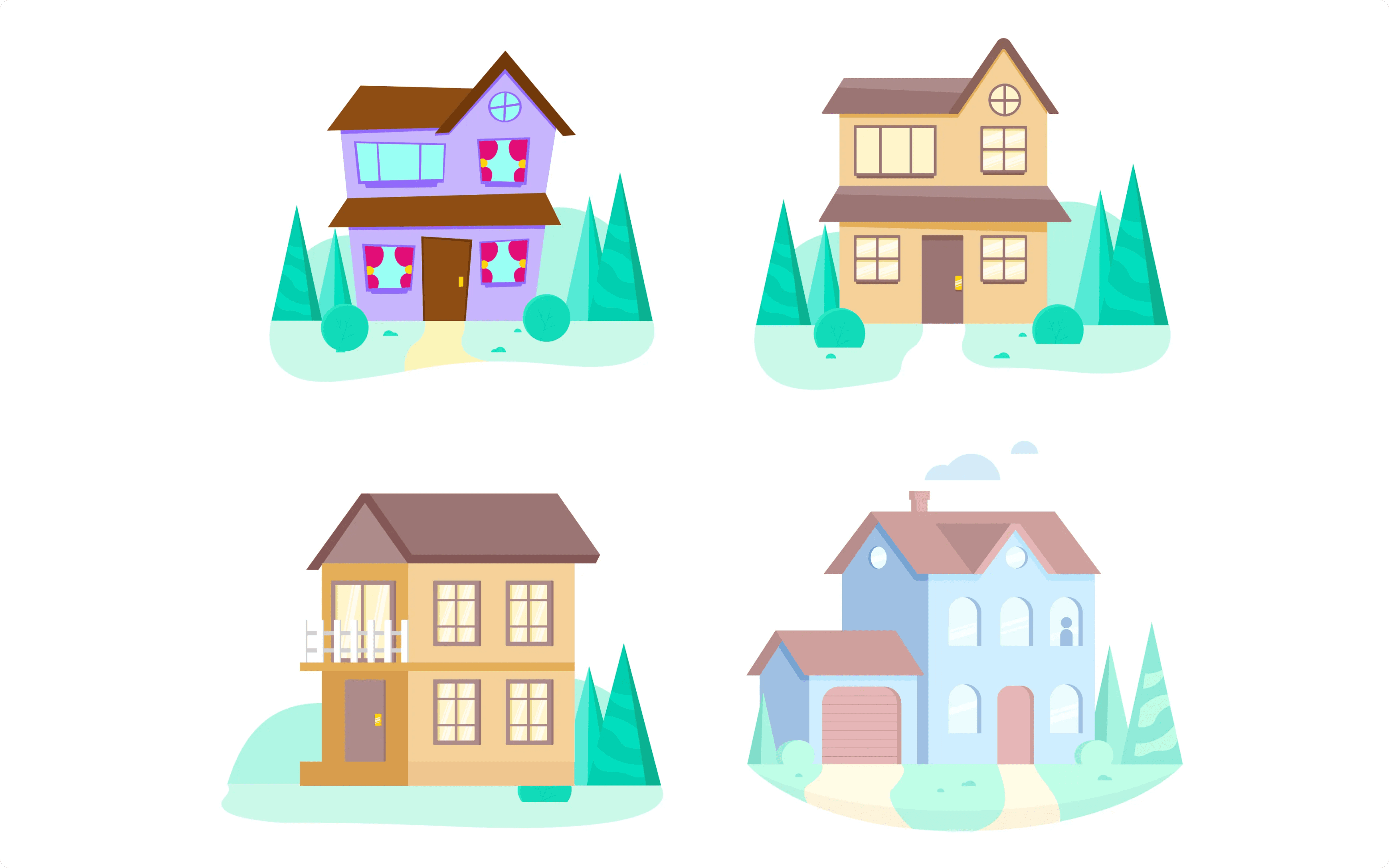
A house being built became the spine of the narrative: life and the home go on, because the family's expenses are covered. That solved the hardest constraint, showing loss without showing loss. Construction reads as continuity, so the emotional weight lands without a single literal depiction of the event being insured against.
Storyboards and rough frames tested whether the metaphor held across all three territories before any animation time was spent.
Initial sketches

Exploring the right style
The giraffe mascot was used deliberately to keep the human, approachable register present in the heavier moments.
Variations: where the rules got written
Each scene was built out in variations, with timing, easing, and weight tested against the tone rather than only against the storyboard. Supporting symbols, the lock, the heart, and the clock, were animated as a family so they read as one system rather than separate icons. The giraffe mascot was used deliberately to keep the human, approachable register present in the heavier moments.
Every variation that was rejected clarified what YuLife motion is not, and every one that was approved became a defensible example.
Final: documented from proof, not theory
The finished onboarding animation shipped with hero illustrations and supporting animated scenes, all aligned to the brand's visual language, and became the reference implementation.
The guideline was then built directly from it. Its spreads are not abstract theory; they are the decisions made during the prototype, documented with the work that proves them:
Animation examples with construction breakdowns, so a reader sees how a shot is assembled, not just the result
Character animation principles, including easing behaviour
Lettering for video, covering typographic treatment in motion
Do's and don'ts, written for people who need a decision rather than a discussion
Outcome and impact
YuLife went from having motion with no reference point to having a single source of truth, grounded in a piece that had already shipped and been approved. Internal designers and commissioned agencies were briefed from the same document, which turned motion consistency from an individual judgement call into a repeatable process. The onboarding animation itself gave new users an emotional, brand-true explanation of the product at the exact moment they were deciding to trust it.
Video recording of the animation guidelines
Selected pages from the guideline


